You Have More Data Than You Think
Every time someone opens your chat widget, something remarkable happens. They reveal their location, their device, the page they care about, the questions they're asking, how they feel about the answer — and whether any of it moved them to take action.
Most businesses never see any of this. They know their chatbot "handled X conversations this month." Full stop. They have no idea if those conversations came from Saudi Arabia or Singapore, whether customers left frustrated or satisfied, which topics are exploding in volume, or what percentage of chats turn into actual sales.
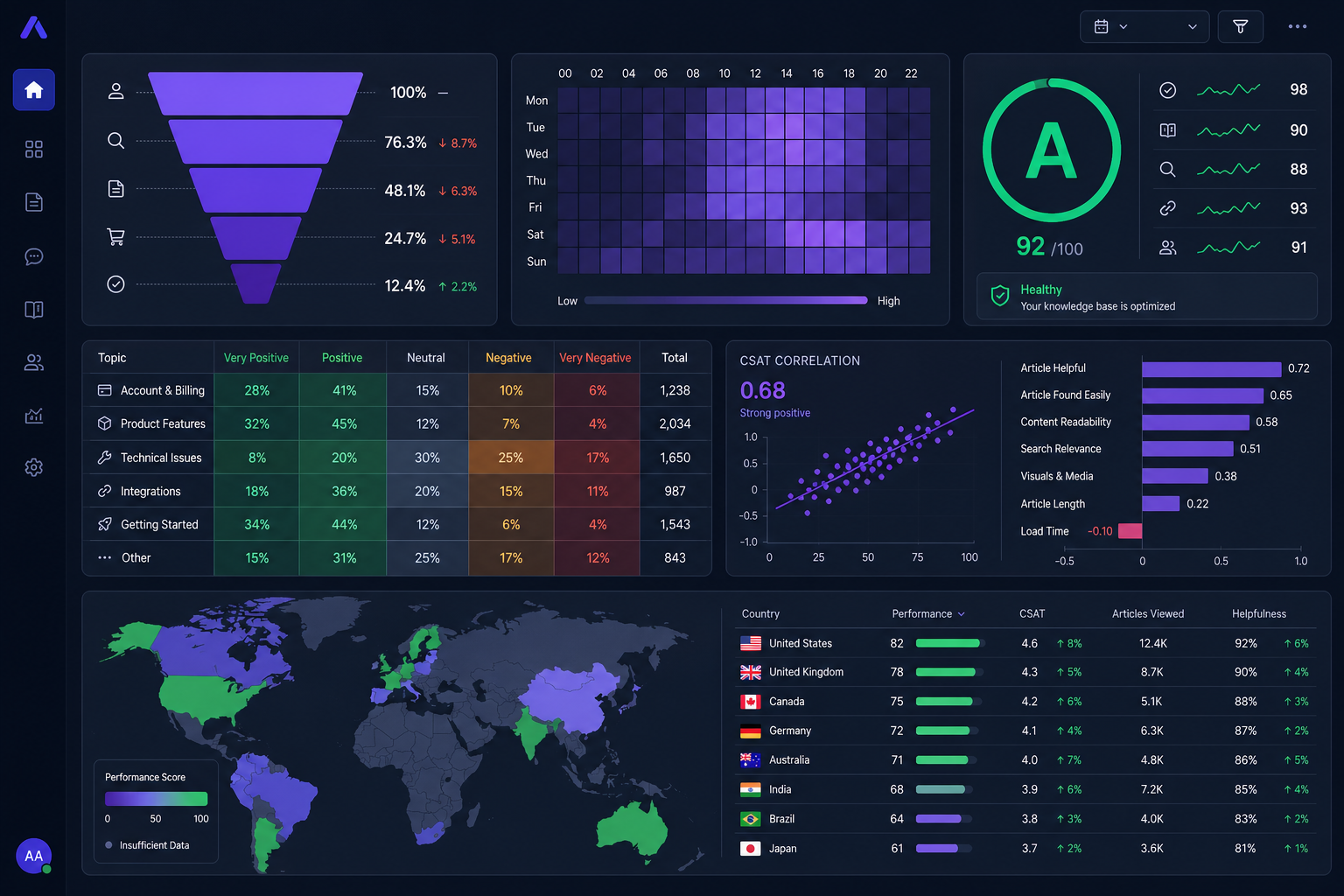
The new Intelligence Dashboard in Mujib changes this entirely. It's built on data your chatbot was already collecting — now surfaced as seven interconnected analytics panels, each designed to answer a specific business question. Combined with Proactive Chat Triggers, you don't just analyze behaviour — you act on it in real time.
This guide walks through every feature, explains what question it answers, and shows you exactly how to act on the insight.
Panel 1: Conversion Funnel — Where Do You Lose People?
The Conversion Funnel is the first panel you see on the Intelligence page, and it's often the most sobering. It breaks your chat traffic into three stages:
- Visitors — everyone who opened the widget (or whose session was created via API)
- Engaged — visitors who actually sent a message
- Converted — visitors who triggered a defined conversion goal
Next to each stage, you see the drop-off rate. A 60% Engaged rate means 40% of people who open the widget leave without sending a single message. A 5% Converted rate means 95% of conversations don't produce the business outcome you defined.
Diagnosing Low Engagement
If your Engaged rate is below 40%, the problem is almost always one of three things:
- The welcome message is too generic. "Hello! How can I help you?" doesn't invite action. "Hi! Ask me anything about our pricing, features, or free trial →" does.
- The widget opens but then just sits there. Consider a Proactive Chat Trigger (Panel 7 below) that sends the first message automatically after 20 seconds.
- The widget is triggering on the wrong pages. A pop-up on your blog's privacy policy page will have terrible engagement. Scope your widget to high-intent pages.
Diagnosing Low Conversion
If people are chatting but not converting, the chatbot isn't closing the loop. Look at what your bot says right before a conversation ends. Is it answering the question and then going silent? A strong bot closes with a clear next step: "Want me to book a demo for you right now?" or "Here's the link to start your free trial: [link]."
Benchmark: A healthy SaaS chatbot typically sees 55–70% engagement and 8–15% conversion on pricing/demo pages. If you're significantly below these numbers, the funnel view tells you exactly which stage to fix first.
Panel 2: Peak Hours Heatmap — When Is Your Audience Most Active?
The heatmap is a 7 × 24 grid — seven days of the week across the top, 24 hours of the day on the left — with each cell coloured by session volume. The darker the purple, the more conversations happened at that day/hour combination.
This looks like a simple visualization, but it's one of the highest-leverage analytics tools available because it aligns your entire team around when customers actually need you.
What to Do With Peak Hours Data
- Schedule promotions for peak hours. If your heatmap shows Tuesday evenings are your busiest period, that's when to send your weekly newsletter or launch a flash sale. Your audience is already primed and present.
- Staff live chat support during peak windows. If you use a human handoff integration, knowing that Friday at 2 PM generates 3× the volume of Monday at 9 AM helps you schedule support coverage efficiently.
- Schedule bot maintenance for dead zones. Every deployment, knowledge base update, or model change should happen during your lowest-traffic window — usually weekday early mornings.
- Identify timezone clusters. If you see a consistent spike at 2–4 AM local time, you probably have a significant user base in a different timezone. Cross-reference with the Country Performance panel to confirm which region.
Real-world signal: One e-commerce brand noticed their heatmap had a sharp Saturday afternoon spike that didn't match any of their marketing campaigns. Investigation revealed a competitor had gone offline, and their shared customer base was landing on Mujib-powered support. They capitalised by creating a dedicated "Switching from [Competitor]" knowledge base section.
Panel 3: KB Health Score — How Well Does Your Bot Actually Know Its Job?
The KB Health Score is possibly the most underrated panel on the page. It gives your knowledge base a letter grade — A, B, C, or D — based on a single, brutally honest metric: the percentage of chat sessions where the bot couldn't give a satisfactory answer.
| Grade | Answer Rate | What It Means |
|---|---|---|
| A | 90%+ | Excellent KB coverage — most customers get accurate answers |
| B | 75–90% | Good, but specific topic gaps exist — check Top Missing list |
| C | 60–75% | Significant gaps — customers are likely frustrated |
| D | <60% | Critical — the bot is failing more than it's helping |
Below the grade, the panel shows your Top Missing list — the specific unanswered questions with the highest recurrence count. These are your immediate action items.
The Weekly KB Improvement Loop
The most effective teams treat the KB Health Score as a weekly ritual:
- Open the Intelligence dashboard every Monday.
- Look at the Top Missing list.
- Pick the top 3–5 questions by count.
- Write knowledge base entries answering them (10–15 minutes of work).
- Watch the score improve the following week.
Teams that follow this loop consistently hit Grade A within 60–90 days of launch, regardless of their starting point.
Panel 4: CSAT × Sentiment Correlation — Does Satisfaction Match What You Measure?
CSAT surveys and sentiment analysis are both ways of measuring customer satisfaction — but they measure different things. CSAT is explicit (customers choose to rate the conversation). Sentiment is implicit (the AI detects emotional tone in the language used). In a healthy system, these two signals should align.
The CSAT × Sentiment panel plots exactly this: for each sentiment category (positive, neutral, negative), it shows the average CSAT star rating given by customers in that category.
What to Look For
- Healthy pattern: Positive sentiment conversations have average CSAT of 4.5+. Neutral conversations hover around 3.5. Negative conversations are below 2.5. This means your bot's emotional intelligence is calibrated correctly — it's reading the room.
- Red flag — flat CSAT across all sentiments: If positive and negative conversations both get average CSAT of 3.0, customers aren't rating honestly — either the rating prompt appears at a bad time, or the scale doesn't resonate with your audience. Review when and how you ask for ratings.
- Red flag — high CSAT on negative sentiment: If negative-sentiment conversations score 4+ stars, it may mean customers are frustrated during the chat but rate positively because the bot eventually resolved their issue. This is actually a good signal — the bot is recovering well from difficult conversations.
Insight: If your CSAT and sentiment scores are consistently diverging, the gap itself is a story worth telling your team. It often reveals blind spots in either your KB content or your rating strategy.
Panel 5: Topic × Sentiment Matrix — Your Most Powerful Strategic Tool
The Topic × Sentiment Matrix is a pivot table that crosses your top 10 discussed topics against the three sentiment categories. Each cell shows the conversation count, with colour intensity proportional to volume.
At a glance, you can see: which topics generate positive conversations, which generate negative ones, and which generate both (which means the experience is inconsistent).
Reading the Matrix
- Topics heavy in positive sentiment (e.g., "Product Features") are your chatbot's strongest areas. These conversations are where the bot shines — customers leave satisfied. Make sure the knowledge base in these areas stays fresh and comprehensive.
- Topics heavy in negative sentiment (e.g., "Billing", "Cancellation") signal process or policy problems that go beyond the chatbot. No amount of KB improvement will fix a genuinely bad refund process — the matrix tells you where to escalate to business leadership.
- Topics split evenly across all three sentiments (e.g., "Shipping") usually indicate inconsistent information in your KB — different entries contradict each other, or the bot is giving different answers to the same question depending on phrasing.
Strategic Planning in 10 Minutes
Spend 10 minutes with this matrix before your next quarterly business review. For each red cell (high negative volume), write one sentence describing the business change required. For each green cell (high positive volume), write one sentence on how to amplify it — more content, faster responses, featured placement. The matrix becomes your chatbot improvement roadmap.
Panel 6: Country Performance — Where Should You Invest?
The Country Performance table answers a question most businesses never even think to ask: which markets are generating the best chatbot ROI?
It ranks every country your visitors come from by session volume, then shows the conversion count and conversion rate side by side. A progress bar makes the rate instantly scannable.
The Hidden Opportunity Pattern
Most businesses find that their conversion rate varies wildly by country — often 5× to 10× difference between their best and worst performers. This isn't random. It reflects:
- Language fit: Countries where your bot responds in their native language convert far better.
- Content relevance: Countries where your KB addresses local regulations, pricing, or logistics convert better.
- Intent alignment: Traffic from some countries is pure curiosity (low conversion expected). Traffic from others is purchase-ready (high conversion expected). Your marketing mix shapes this.
A country with 200 sessions and 0% conversion is screaming for attention. It could be a translation issue, a pricing mismatch, a shipping limitation your bot doesn't explain — or simply a market you haven't invested in yet but clearly has demand.
Action template: For your top 5 countries by session volume, check the conversion rate. For any country above 500 sessions with below 5% conversion, create a dedicated knowledge base section addressing that country's most common questions (identified in the Conversation Insights panel). This single action typically doubles conversion in that market within 30 days.
Feature 7: Proactive Chat Triggers — Stop Waiting, Start Helping
Every panel covered so far is reactive — it shows you what happened. Proactive Chat Triggers are the action layer: they allow your chatbot to reach out to visitors before the visitor has a chance to leave.
The principle is simple. A visitor landing on your pricing page and scrolling for 45 seconds is clearly considering a purchase. An inactivity trigger after 90 seconds can be the nudge that converts curiosity into a demo booking.
The Five Trigger Types
- Time on Page: The visitor has been on the page for N seconds. Best for high-intent pages (pricing, product comparison, checkout).
- Exit Intent: The mouse moves toward the browser's close or back button. This is the classic "Wait, don't go!" trigger. Highly effective on pricing and cart pages.
- Scroll Depth: The visitor has scrolled past N% of the page. If someone reads 70% of your 3,000-word product page, they want information — give it to them.
- Inactivity: No keyboard, mouse, or touch input for N seconds. The visitor is stuck. A gentle prompt — "Need help finding something?" — can restart a stalled buying journey.
- Page URL: The URL contains a specific pattern. Fire one trigger on
/pricing, a different one on/checkout, and a completely different one on/support.
Writing Trigger Messages That Convert
The message text is everything. Here are proven formulas for each trigger type:
- Pricing page, 30s timer: "Comparing plans? I can help you pick the right one in 2 minutes 👋"
- Exit intent on pricing: "Before you go — got a question about pricing? I'll answer it right now."
- 70% scroll on a features page: "You've done your research! Ready to see it in action? I can book a demo instantly."
- 90s inactivity on checkout: "Still there? If you have any questions about this order, I'm right here."
- Support pages: "Looking for something specific? Tell me the issue and I'll find the solution faster."
Notice what these messages have in common: they're short, specific to the page context, low-pressure, and offer something of value. They don't beg — they offer.
Cooldown: Preventing Trigger Fatigue
Every trigger has a cooldown period (default 24 hours, stored in the visitor's browser). This ensures returning visitors aren't bombarded with the same proactive message on every visit. Set the cooldown based on your typical sales cycle — for complex B2B deals, 72 hours may be more appropriate than 24.
Putting It All Together: A Weekly Intelligence Routine
The Intelligence Dashboard is most powerful when used as a weekly ritual, not a one-time exploration. Here's a 20-minute routine that high-performing teams run every Monday:
- Minutes 1–3: Check the Conversion Funnel. Did engagement or conversion rates change significantly from last week? Investigate any drops above 5 percentage points.
- Minutes 4–6: Look at the KB Health Score and Top Missing list. Pick the #1 unanswered question and write a knowledge base entry for it.
- Minutes 7–10: Scan the Topic × Sentiment Matrix. Flag any topic with a significant increase in negative sentiment since last week.
- Minutes 11–13: Check Country Performance. Flag any country with >100 sessions and <3% conversion.
- Minutes 14–17: Review the Peak Hours Heatmap. Are your active office hours aligned with your customers' peak activity? If not, consider scheduling a proactive trigger or a marketing send to coincide with peak hours.
- Minutes 18–20: Review active triggers. Are the right triggers active on the right pages? Consider A/B testing a new message for your highest-traffic trigger.
Teams that run this routine consistently report measurable improvements within the first 60 days: higher engagement rates, better KB health scores, and most importantly, more conversions from the same amount of traffic.
Getting Started
The Intelligence Dashboard is available to all Mujib projects today — no configuration required. Open your project, click Intelligence in the left sidebar, and you'll see data immediately if you've had conversations in the past 30 days.
To unlock Conversion Tracking, go to Conversions in the sidebar and create your first goal. Add one line of JavaScript where your conversion happens and you're live.
To activate Proactive Triggers, go to Chat Triggers and click New Trigger. Start with a simple Time on Page trigger on your pricing page — 30 seconds, short message, 24-hour cooldown — and measure the engagement lift over the next two weeks.
The data is already there. It's time to read it.
عندك بيانات أكثر مما تتوقع
في كل مرة يفتح فيها شخص ويدجت الدردشة، يحدث شيء مثير للاهتمام. يكشف عن موقعه وجهازه والصفحة التي يهتم بها والأسئلة التي يطرحها وكيف شعر تجاه الإجابة — وهل أي من هذا دفعه لاتخاذ إجراء.
معظم الشركات لا ترى شيئاً من هذا. تعرف أن بوتها "تعامل مع X محادثة هذا الشهر." انتهى. لا تعرف إن كانت المحادثات قادمة من السعودية أو سنغافورة، أو ما إذا كان العملاء يغادرون محبطين أو راضين، أو أي الموضوعات ترتفع في الحجم، أو ما نسبة المحادثات التي تتحول لمبيعات حقيقية.
لوحة الذكاء الجديدة في مجيب تغيّر هذا كلياً. مبنية على بيانات كان بوتك يجمعها بالفعل — الآن مُقدَّمة كسبعة لوحات تحليلية متكاملة، كل واحدة مصمّمة للإجابة على سؤال تجاري محدد. مع بادئات الدردشة الاستباقية، أنت لا تحلّل السلوك فحسب — بل تتصرف بناءً عليه في الوقت الفعلي.
هذا الدليل يشرح كل ميزة ويوضح السؤال الذي تجيب عنه وكيف تتصرف بناءً على المعلومة.
اللوحة 1: قمع التحويل — أين تخسر العملاء؟
قمع التحويل هو أول لوحة تراها في صفحة الذكاء، وغالباً الأكثر إثارةً للتفكير. يقسّم حركة الدردشة إلى ثلاث مراحل:
- الزوار — كل من فتح الويدجت
- المتفاعلون — الزوار الذين أرسلوا رسالة فعلياً
- المحوَّلون — الزوار الذين أطلقوا هدف تحويل محدّداً
بجانب كل مرحلة ترى معدل التراجع. معدل تفاعل 60% يعني أن 40% من الناس الذين يفتحون الويدجت يغادرون بدون إرسال رسالة واحدة. معدل تحويل 5% يعني أن 95% من المحادثات لا تُنتج النتيجة التجارية التي حدّدتها.
تشخيص انخفاض التفاعل
إذا كان معدل التفاعل أقل من 40%، المشكلة غالباً واحدة من ثلاثة أشياء:
- رسالة الترحيب عامة جداً. "مرحباً! كيف يمكنني مساعدتك؟" لا تدعو للتفاعل. "مرحباً! اسألني أي شيء عن الأسعار أو المميزات أو التجربة المجانية ←" تفعل ذلك.
- الويدجت يفتح ثم يجلس بلا حراك. فكّر في بادئة دردشة استباقية (اللوحة 7 أدناه) ترسل الرسالة الأولى تلقائياً بعد 20 ثانية.
- الويدجت يظهر على الصفحات الخاطئة. ظهوره على صفحة سياسة الخصوصية سيعطي تفاعلاً رهيباً. حصّره على الصفحات ذات النية العالية.
تشخيص انخفاض التحويل
إذا كان الناس يتحدثون لكن لا يتحولون، فالبوت لا يُغلق الحلقة. انظر ماذا يقول بوتك قبل نهاية المحادثة مباشرة. هل يجيب على السؤال ثم يصمت؟ بوت قوي يُغلق بخطوة تالية واضحة: "هل تريد مني حجز عرض توضيحي الآن؟" أو "إليك رابط بدء التجربة المجانية: [رابط]."
معيار مرجعي: بوت SaaS صحي يرى عادةً 55-70% تفاعل و8-15% تحويل على صفحات التسعير والعروض. إذا كنت أقل بكثير، الـ funnel يخبرك أي مرحلة تصلح أولاً.
اللوحة 2: خريطة حرارة ساعات الذروة — متى جمهورك أنشط؟
الخريطة الحرارية شبكة 7 × 24 — سبعة أيام الأسبوع في الأعلى، 24 ساعة على الجانب — كل خلية ملوّنة حسب حجم الجلسات. كلما كان البنفسجي أغمق، كلما كانت المحادثات أكثر في تلك الفترة.
هذا يبدو تصوراً بسيطاً، لكنه من أعلى أدوات التحليل تأثيراً لأنه يوحّد فريقك حول متى يحتاجك العملاء فعلاً.
ماذا تفعل ببيانات ساعات الذروة
- جدوِل العروض الترويجية لساعات الذروة. إذا أظهرت خريطتك أن مساء الثلاثاء هو أكثر فتراتك ازدحاماً، فهذا هو وقت إرسال نشرتك الأسبوعية أو إطلاق تخفيض مفاجئ.
- وفّر تغطية دعم مباشر خلال نوافذ الذروة. إذا علمت أن الجمعة الساعة 2 ظهراً تولّد 3 أضعاف حجم الاثنين الساعة 9 صباحاً، يمكنك جدولة تغطية الدعم بكفاءة.
- جدوِل صيانة البوت لأوقات الهدوء. كل تحديث لقاعدة المعرفة أو تغيير نموذج يجب أن يحدث في نافذتك الأقل حركةً — عادةً ساعات الصباح الباكر في أيام الأسبوع.
- حدّد التجمعات الزمنية. إذا رأيت ارتفاعاً مستمراً من 2-4 صباحاً بتوقيتك المحلي، لديك على الأرجح قاعدة مستخدمين كبيرة في منطقة زمنية مختلفة.
اللوحة 3: درجة صحة قاعدة المعرفة — هل يعرف بوتك عمله؟
درجة الصحة هي على الأرجح أقل اللوحات استحقاقاً للاهتمام وأكثرها تأثيراً. تمنح قاعدة معرفتك تقديراً بالحروف — A وB وC وD — بناءً على مقياس واحد وصادق: نسبة جلسات الدردشة التي لم يستطع فيها البوت إعطاء إجابة مُرضية.
| الدرجة | معدل الإجابة | ما يعنيه |
|---|---|---|
| A | 90%+ | تغطية ممتازة — معظم العملاء يحصلون على إجابات دقيقة |
| B | 75–90% | جيد، لكن توجد فجوات موضوعية محددة — تحقق من قائمة الأعلى نقصاً |
| C | 60–75% | فجوات كبيرة — العملاء على الأرجح محبطون |
| D | <60% | حرج — البوت يفشل أكثر مما يساعد |
حلقة التحسين الأسبوعية لقاعدة المعرفة
أكثر الفرق فعاليةً تتعامل مع درجة الصحة كطقس أسبوعي:
- افتح لوحة الذكاء كل اثنين.
- انظر قائمة "أكثر ما ينقص".
- اختر أكثر 3-5 أسئلة تكراراً.
- اكتب إدخالات في قاعدة المعرفة تجيب عليها (10-15 دقيقة عمل).
- راقب تحسّن الدرجة الأسبوع التالي.
الفرق التي تتبع هذه الحلقة تصل باستمرار إلى الدرجة A خلال 60-90 يوماً من الإطلاق.
اللوحة 4: CSAT × المشاعر — هل يتطابق الرضا مع ما تقيسه؟
استبيانات CSAT وتحليل المشاعر كلاهما وسيلة لقياس رضا العملاء — لكنهما يقيسان أشياء مختلفة. CSAT صريح (العملاء يختارون تقييم المحادثة). المشاعر ضمني (الذكاء الاصطناعي يكتشف النبرة العاطفية في اللغة). في نظام صحي، يجب أن يتوافق الإشاران.
لوحة CSAT × المشاعر ترسم هذا بالضبط: لكل فئة مشاعر (إيجابي، محايد، سلبي)، تُظهر متوسط تقييم النجوم من العملاء في تلك الفئة.
رؤية: إذا كانت درجات CSAT والمشاعر تتباعد باستمرار، الفجوة نفسها قصة تستحق مشاركتها مع فريقك. غالباً تكشف نقاطاً عمياء في محتوى قاعدة المعرفة أو استراتيجية التقييم.
اللوحة 5: مصفوفة الموضوع × المشاعر — أقوى أداة استراتيجية
المصفوفة جدول محوري يتقاطع فيه أكثر 10 موضوعات نقاشاً مع ثلاث فئات من المشاعر. كل خلية تُظهر عدد المحادثات بكثافة لونية تتناسب مع الحجم.
- الموضوعات ذات المشاعر الإيجابية الكثيرة (مثل "مميزات المنتج") هي أقوى مناطق بوتك.
- الموضوعات ذات المشاعر السلبية الكثيرة (مثل "الفوترة") تشير لمشاكل في العمليات أو السياسات تتجاوز البوت.
- الموضوعات الموزّعة بالتساوي عادةً تعني معلومات متناقضة في قاعدة المعرفة.
اللوحة 6: أداء البلدان — أين تستثمر؟
جدول أداء البلدان يجيب على سؤال لا تخطر للشركات: أي الأسواق تحقق أفضل عائد من البوت؟
يرتّب كل بلد تأتي منه زيارات حسب حجم الجلسات، ثم يُظهر عدد التحويلات ومعدلها جنباً إلى جنب مع شريط مرئي.
قالب العمل: لأكثر 5 بلدان جلساتٍ، تحقق من معدل التحويل. لأي بلد يتجاوز 500 جلسة بأقل من 5% تحويل، أنشئ قسماً مخصصاً في قاعدة المعرفة يعالج أكثر أسئلة ذلك البلد شيوعاً. هذا الإجراء الواحد يُضاعف التحويل عادةً في ذلك السوق خلال 30 يوماً.
الميزة 7: بادئات الدردشة الاستباقية — لا تنتظر، ابدأ المساعدة
كل لوحة سابقة تفاعلية — تُظهر ما حدث. بادئات الدردشة طبقة العمل: تتيح لبوتك التواصل مع الزوار قبل أن يغادروا.
المبدأ بسيط. زائر على صفحة التسعير يتصفح 45 ثانية يفكّر بالوضوح في الشراء. بادئة عدم نشاط بعد 90 ثانية قد تكون الدفعة التي تحوّل الفضول لحجز عرض توضيحي.
صياغة رسائل بادئات تُحوِّل
- صفحة التسعير، 30 ثانية: "تقارن بين الخطط؟ أساعدك تختار المناسبة في دقيقتين 👋"
- نية المغادرة من التسعير: "قبل ما تروح — عندك سؤال عن الأسعار؟ أجاوبك الحين."
- 70% تمرير على صفحة مميزات: "قرأت كثيراً! جاهز تشوف النظام وقيد العمل؟ أقدر أحجزلك عرضاً الحين."
- 90 ثانية عدم نشاط عند الدفع: "لا تزال هنا؟ إذا عندك سؤال عن هذا الطلب، أنا هنا."
روتين الذكاء الأسبوعي: 20 دقيقة تصنع فارقاً
لوحة الذكاء أكثر قوةً عندما تستخدمها كطقس أسبوعي لا استكشافاً لمرة واحدة. إليك روتين 20 دقيقة يديره الفرق عالي الأداء كل اثنين:
- الدقائق 1-3: تحقق من قمع التحويل. هل تغيّر معدل التفاعل أو التحويل بشكل ملحوظ؟
- الدقائق 4-6: انظر درجة الصحة وقائمة أكثر ما ينقص. اختر السؤال #1 واكتب إدخالاً في قاعدة المعرفة.
- الدقائق 7-10: امسح مصفوفة الموضوع × المشاعر. ضع علامة على أي موضوع ارتفعت فيه المشاعر السلبية بشكل ملحوظ.
- الدقائق 11-13: تحقق من أداء البلدان. ضع علامة على أي بلد لديه أكثر من 100 جلسة وأقل من 3% تحويل.
- الدقائق 14-17: راجع خريطة الذروة. هل ساعات عملك تتوافق مع ذروة نشاط عملائك؟
- الدقائق 18-20: راجع البادئات النشطة. هل البادئات الصحيحة نشطة على الصفحات الصحيحة؟
كيف تبدأ
لوحة الذكاء متاحة لجميع مشاريع مجيب اليوم — لا إعداد مطلوب. افتح مشروعك، اضغط الذكاء في الشريط الجانبي الأيسر، وستجد البيانات فوراً إذا كان لديك محادثات في آخر 30 يوماً.
لتفعيل تتبع التحويلات، اذهب إلى التحويلات في الشريط وأنشئ هدفك الأول. أضف سطراً واحداً من JavaScript أينما يحدث التحويل وأنت جاهز.
لتفعيل البادئات الاستباقية، اذهب إلى بادئات الدردشة واضغط بادئة جديدة. ابدأ ببادئة بسيطة "الوقت على الصفحة" في صفحة التسعير — 30 ثانية، رسالة قصيرة، فترة راحة 24 ساعة — وقِس ارتفاع التفاعل خلال أسبوعين.
البيانات موجودة بالفعل. حان وقت قراءتها.